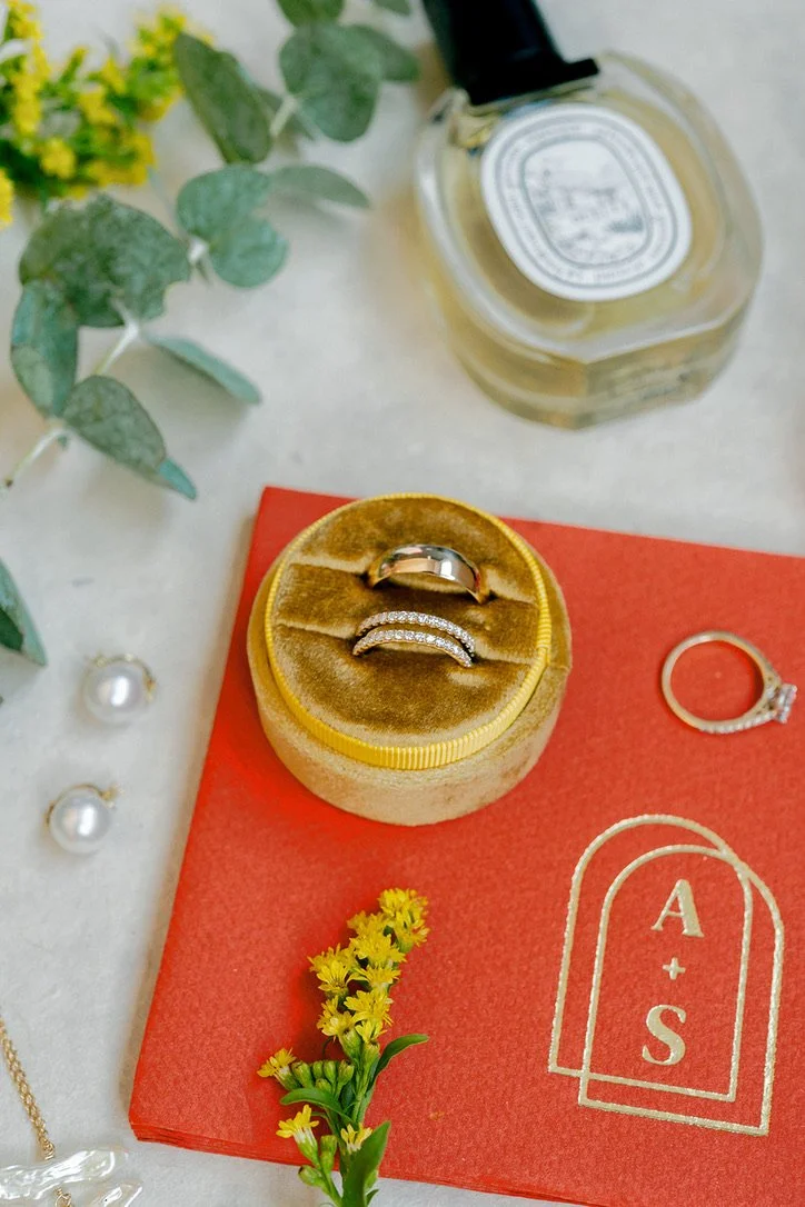
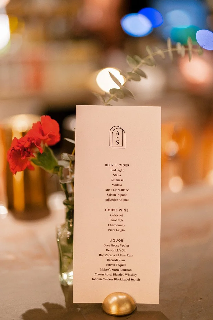
EVENT BRANDING
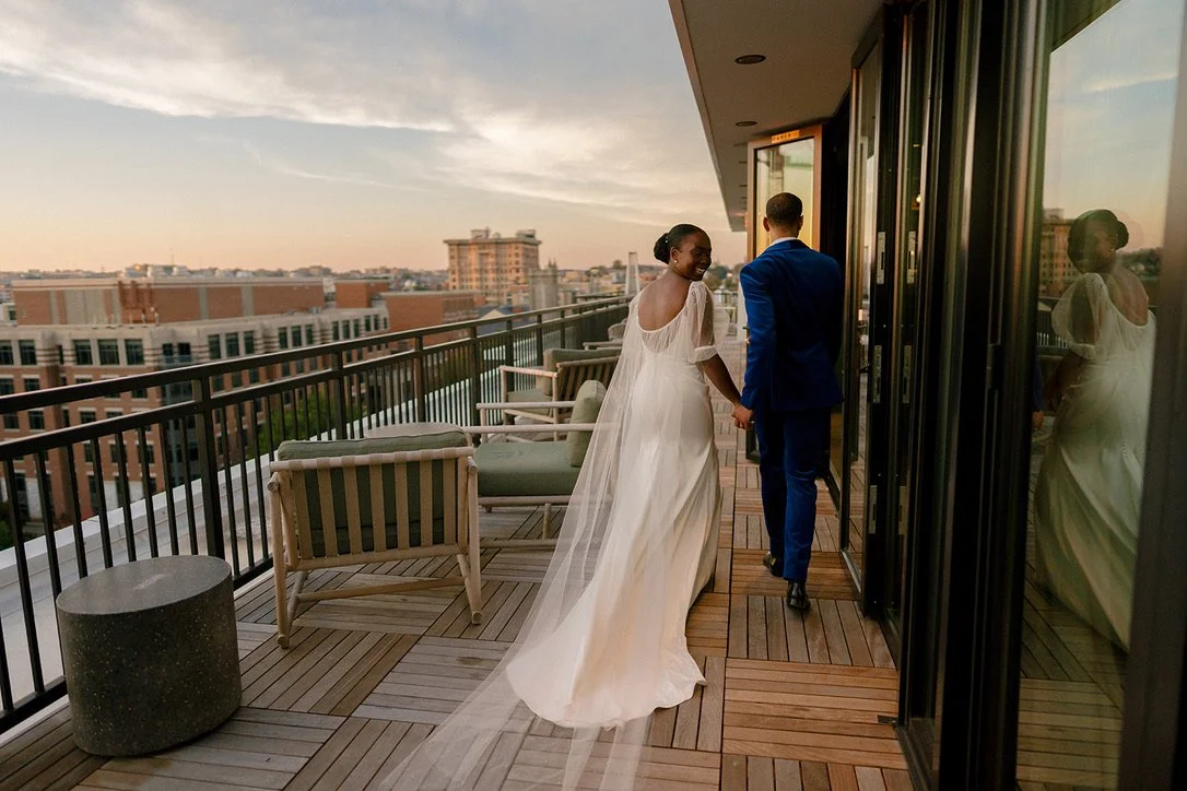
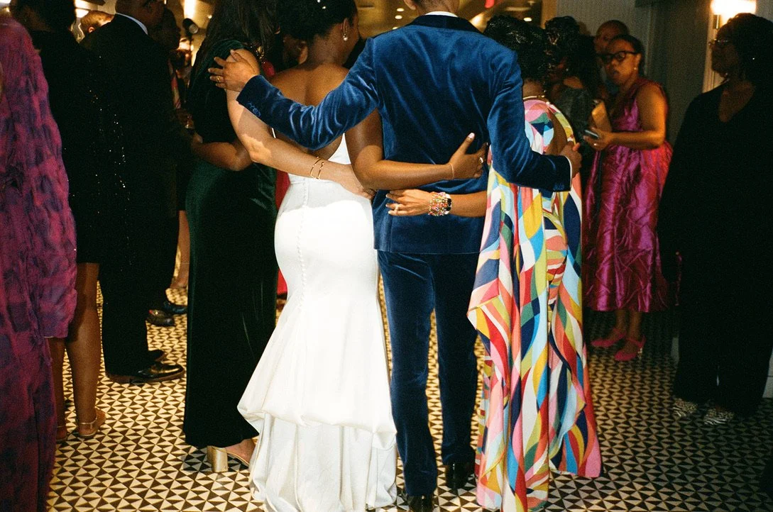
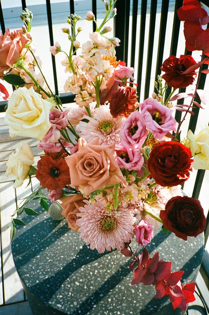
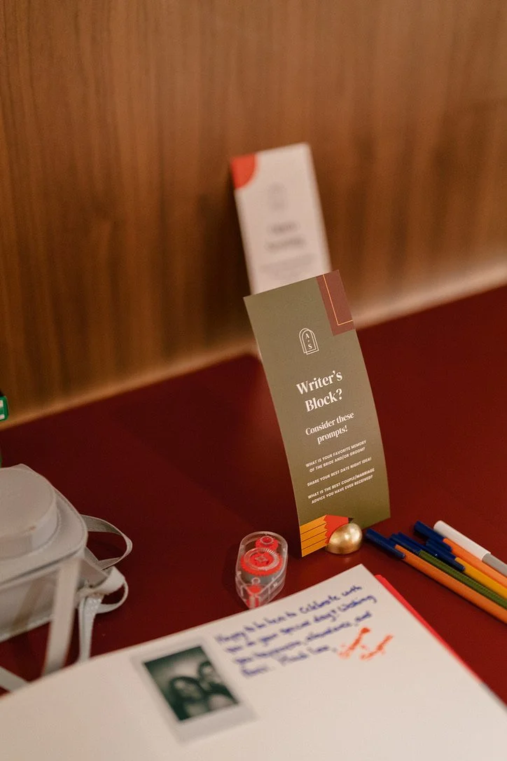
I approached my wedding as a comprehensive branding and logistical project, centered around hosting an authentic, custom celebration in the heart of Washington D.C. The design identity was built on a rich palette of deep autumnal hues juxtaposed with the crispness of navy blue, intentionally mirroring the hazy coziness of an October dusk. To establish a sophisticated visual system, I paired classic typography with modern geometric touches, utilizing shapes and color blocking as a cohesive thread throughout all collateral. These geometric elements were deliberately used as a visual metaphor to symbolize the merging of two lives. Logistically, I secured a venue with an inherent aesthetic and energy that reinforced the mood we aimed to convey. I managed local vendors, ensuring every detail, from neighborhood flowers to local bakery cupcakes, reflected our flair as a couple.

A seamless, cohesive, and deeply personal experience that successfully merged high-level conceptual design with meticulous event execution. This project demonstrates my ability to conceptualize, brand, and execute detailed, large-scale experiences.
RESULT
Anike Skeete
Art Direction | Project Management | Event Coordination
Kathy Chen
Graphic Design | Production Design
Margaret Wroblewski
Photography
Basecamp & Moo
Printing
CREDIT